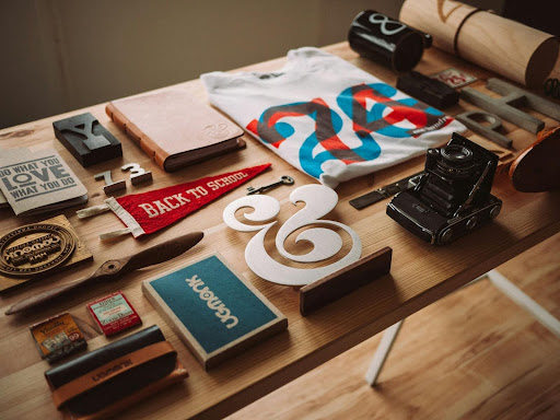
Dynamic design has never been about throwing paint at a wall and hoping the splatter spells your company name. Good branding is deliberate, strategic, and often a little audacious. We have assembled six essential moves for creating a brand that speaks with confidence rather than a nervous whisper. Expect practical pointers, a hint of sarcasm, and zero motivational posters.
- Craft a Story Your Audience Wants to Repeat
A brand with no story is just stationery. Before color palettes and logo shapes, settle the narrative. Why do you exist, and why should anyone care? That tale needs a single sentence version a sales intern can remember on day one, as well as a back-of-the-napkin epic for investors over coffee. If you need an example of a brand-first storytelling approach, see how Hello Mellow turns relaxation into its entire value proposition. Their name, language, and visuals hum the same tune. Do the same and you will never have to fake consistency.
- Design for Scalability, Not Just the Mockup
Logos look gorgeous on a designer’s 27-inch monitor. They look less impressive when reduced to a favicon or stretched across a trade-show banner. Commit to a design system that scales. Think flexible grids, vector artwork, and clear whitespace rules. Grab a printout, resize to one inch, and squint. If the mark dissolves into soup, go back to the sketchpad. Your future self will thank you when a sponsorship request arrives with a logo box smaller than a postage stamp.
- Choose Color With Purpose, Then Stick to It
We all enjoy a splash of cerulean, although none of us agree on how to pronounce it. Color choices should signal personality, function, and familiarity. Finance firms reach for navy because it whispers stability. Wellness brands lean into greens and pinks because they suggest vitality and care. Once you land on two primary colors and maybe one accent, lock the palette tighter than a streaming password in a shared apartment. Reproducing the same hue across web, print, and packaging avoids the “why does our red look salmon in Minneapolis” conversation.
- Treat Typography as Vocal Chords, Not Decoration
Fonts convey tone long before words register. A heavy slab serif carries authority. A rounded sans serif feels friendly. Mixing the two can generate a layered voice, though we recommend no more than three families unless you collect chaos as a hobby. Kerning, leading, and hierarchy must be spelled out in a style guide that even the intern’s cousin can follow. Poorly considered typography is like speaking through a kazoo during a board meeting: memorable, but for the wrong reason.
- Build Motion Into the Brand Toolkit
Screens dominate most touchpoints, and static graphics alone feel dated. Subtle animation breathes life into a logo, clarifies user flows, and keeps viewers engaged long enough to read the small print. Motion must respect the brand character. A luxury label can animate with gentle fades, while a sports brand might favor brisk sweeps and kinetic transitions. Test across devices and connection speeds, otherwise your interactive masterpiece will turn into a slideshow on rural Wi-Fi.
- Gather Feedback, Iterate, Repeat
Even the sharpest launch cannot anticipate every use case. Trade-show booths, co-branding, and seasonal campaigns reveal stresses no focus group predicted. Cultivate a feedback loop with designers, marketers, and customer support. Small adjustments made quarterly prevent the five-year meltdown that forces a costly rebrand. Evolution signals that the company listens and adapts rather than reacts only during crises.
A bold brand balances vision with practicality. Nail the story, lock the visuals, keep motion purposeful, and stay open to improvement. Do that, and your audience will recognize your mark faster than they find the skip button on pre-roll ads.


